
WHAT YOUR WEBSITE IS SAYING ABOUT YOUR BUSINESS
What Your Website Is Saying About Your Business (Before You Say a Word)
Most businesses put a lot of thought into their website copy.
Clear messaging. Strong positioning. A well-designed site.
But there’s another layer communicating just as quickly—and often more powerfully—than words.
Your visuals.
Before someone reads a sentence, they’ve already formed an impression. They’ve decided whether your business feels credible, current, and aligned—or not. And that decision happens fast.
The Real Issue Isn’t Effort—It’s Alignment
From what I’ve seen across a wide range of businesses, the issue isn’t a lack of effort.
It’s misalignment.
The messaging says one thing. The visuals say another.
A company positions itself as modern and forward-thinking, but the images feel dated.
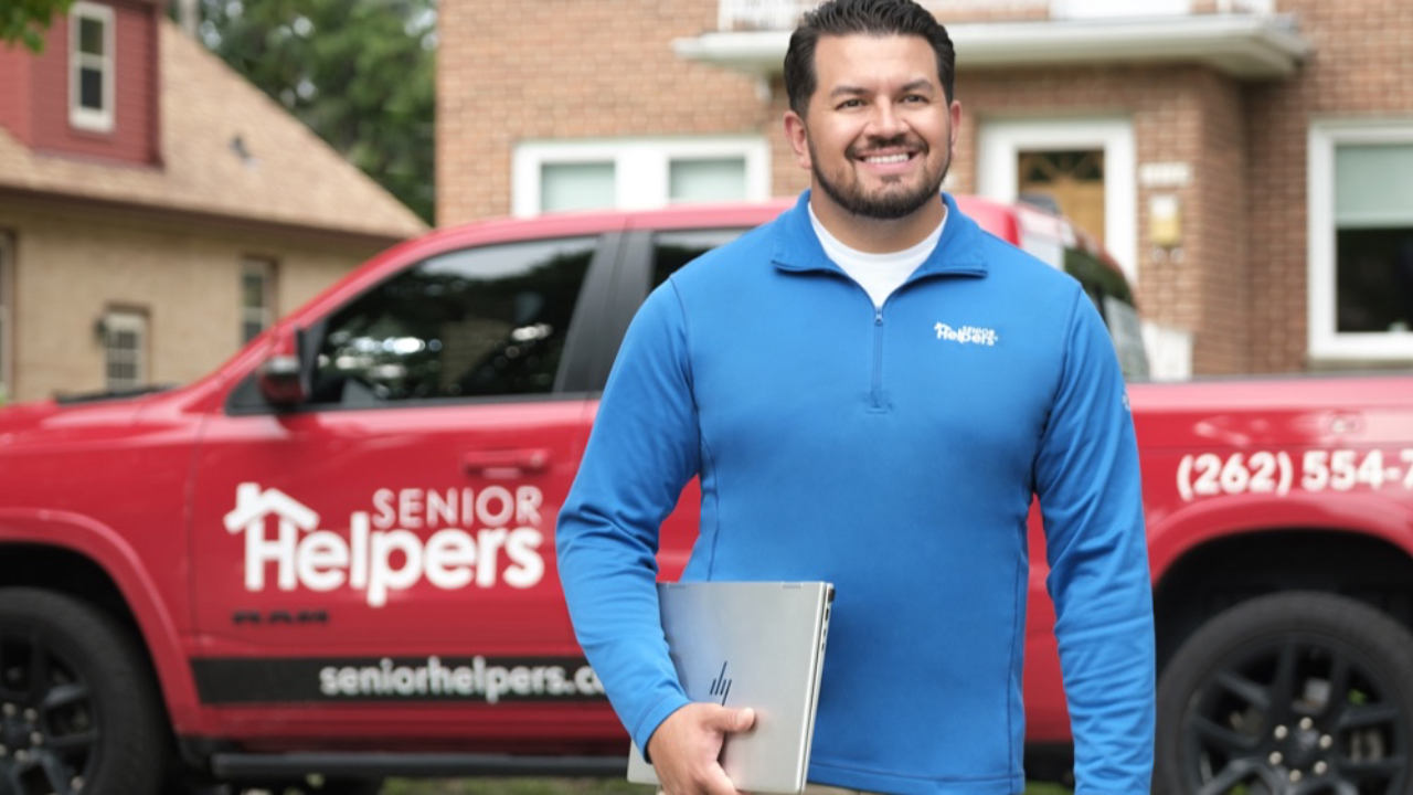
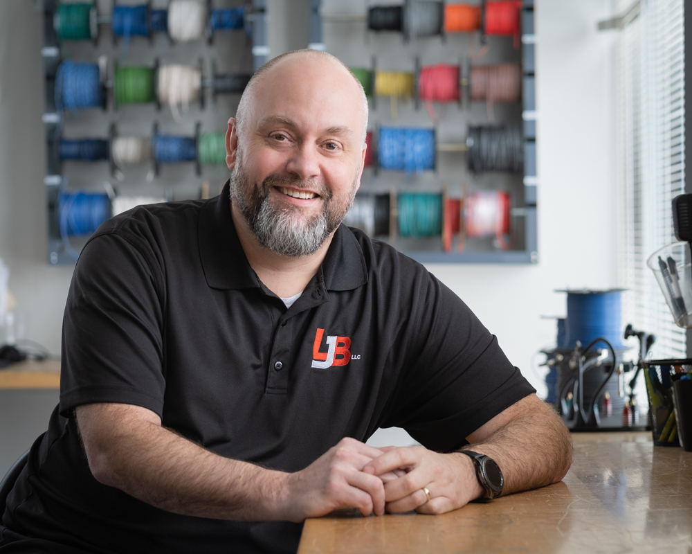
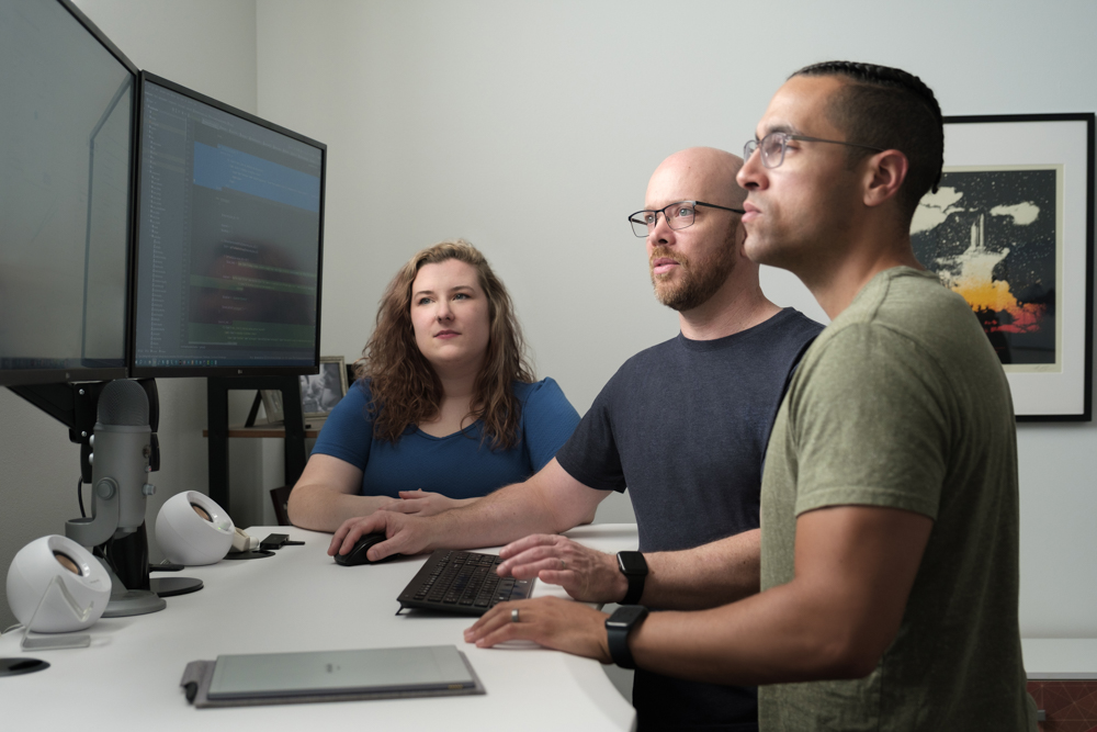
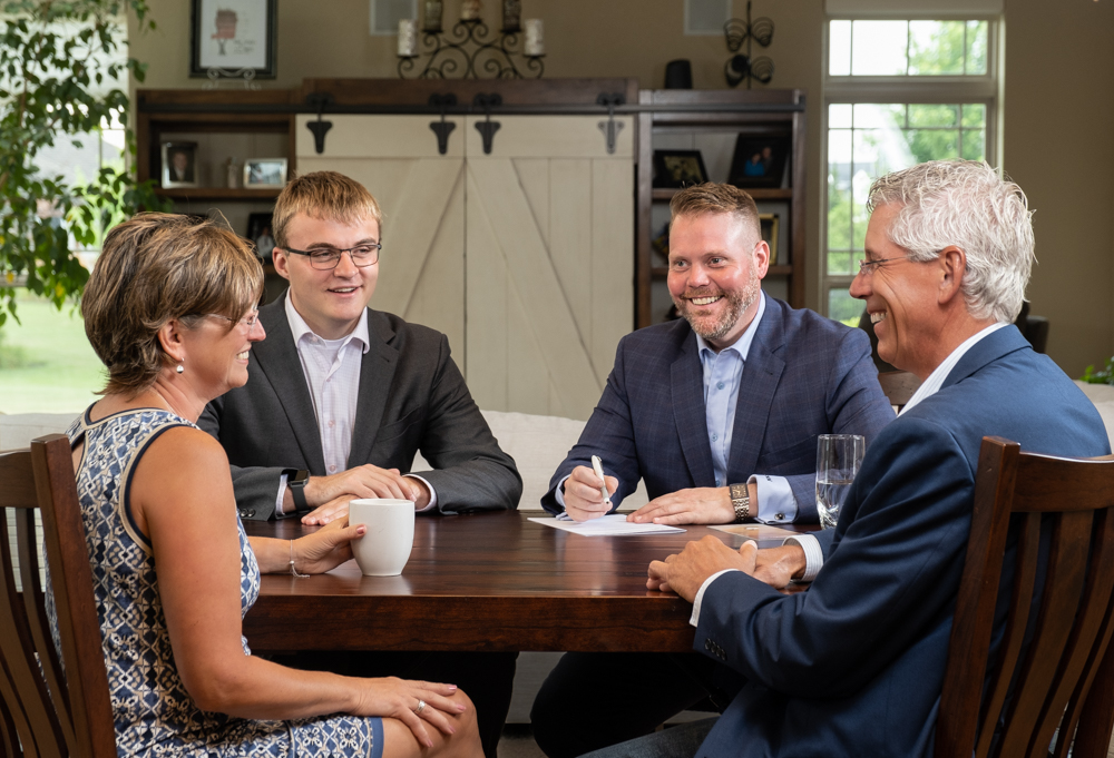
A team emphasizes relationships and people, but there are no real human moments shown.
The tone is confident and clear, but the photos feel stiff or generic.
Individually, none of these seem like major issues.
But together, they create friction.
And friction quietly erodes trust.
Where This Shows Up Most: Website Updates
This kind of disconnect often becomes most visible during a website update or redesign.
There’s usually a strong focus on structure, messaging, and user experience—getting the layout right, refining the copy, and improving how someone moves through the site.
But when it comes to visuals, they’re often treated as an afterthought.
I’ll occasionally get a call from a business owner who says:
“My web designer told me I need five photos.”
When I ask what those photos should be or how they’ll be used, the answer is often unclear.
There’s no direction around what the images need to communicate, how they align with the messaging, or where they fit within the page.
So we step back and look at the full picture—reviewing the copy, understanding the layout, and identifying what each image actually needs to do and where it belongs.
When visuals aren’t planned with intention, they often default to generic choices—or worse, misalignment.
What Actually Builds Credibility
Credibility isn’t built by design or copy alone.
It comes from alignment—when everything feels like it belongs together.
In my experience, strong visual credibility comes down to three things:
Consistency
The images feel cohesive across your website and materials.
Relevance
The visuals reflect your business as it is today—not where it was.
Realness
The images show how you actually work.
When those are in place, people feel it—even if they can’t explain it.
A Simple Way to Evaluate Your Website
Look at your website as if you were seeing it for the first time.
- Do the visuals reinforce what your messaging is saying?
- Do they reflect where your business is now?
- Do they help someone quickly understand how you work?
These aren’t questions of perfection. They’re questions of alignment.
Three Simple Ways to Improve Alignment
The good news is this doesn’t require a full overhaul.
Small, intentional adjustments can make a significant difference.
Start with the message, not the images
Get clear on what each page needs to communicate before choosing visuals.
Think in terms of placement and purpose
Ask where the image lives and what it supports—not just how many you need.
Update with intention, not urgency
If your business has evolved, your visuals should reflect that.
The Real Problem Most Businesses Have
Most businesses don’t have a visibility problem.
They have an alignment problem—and it shows up visually.
And what gets labeled as “good enough” is often just something that hasn’t been fully thought through yet.
Final Thought
Credibility isn’t built in one big moment.
It’s built in the details—many of which are seen before a single word is read.
Planning a website update or redesign?
This is often where visual misalignment shows up the most.
Before you default to “a few updated photos,” it’s worth thinking through what each image actually needs to communicate—and where it fits.
That’s where I typically come in—helping businesses create images that align with their messaging, their brand, and how they actually work.
If you’re in that stage, I’d be glad to connect and take a look at what you’re working on.
Live Out Loud 😊 Stacy
Stacy Kaat
Stacy@stacykaat.com
414-758-0622
Business & Workplace Photography
Director of Photography
